OU Campus Components vs. Snippets
By Jeanine | 2019-07-08
Components and snippets can often be used interchangeably within OU Campus for the same purpose, however, there are a number of differences between the two. When should you choose a component over a snippet or vice versa? Where can each be used and how are they managed?
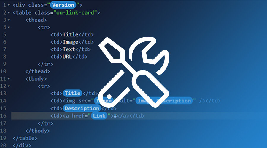
For years, managing advanced features within OU Campus has been handled using a variety of snippets and assets. As a reminder, snippets come in two versions: 1) an inserted chunk of code or text that will be manually edited and managed and 2) table-transformations, which will be the majority of the examples for this article. Assets, similarly, can be used to manage a chunk of code, text, form, or collection of photos within a page; however, since each asset is centrally updated, every instance of one asset points to one source.
If you had wanted to customize a feature specific for each use, previously you would have only had snippets as an option. Recently, though, OmniUpdate released a feature called components. Components and snippets can often be used interchangeably for the same purpose, however, there are a number of differences between the two. When should you choose a component over a snippet or vice versa? Where can each be used and how are they managed?
In this article, we will dive into specific use cases for both components and snippets, so you can identify which feature will be more suited to your needs within OU Campus.
Inserting and Modifying Content
User Interface Examples
Let’s start out by comparing the typical view of snippets and components for your end-users.
OU Campus Edit View for Snippets vs. Simple Components
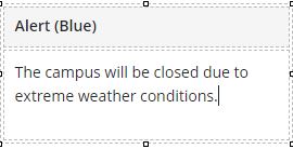
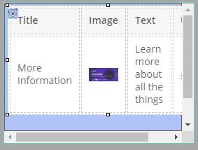
Snippet
Editing the message for this snippet is done by modifying text within the table cell:
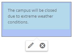
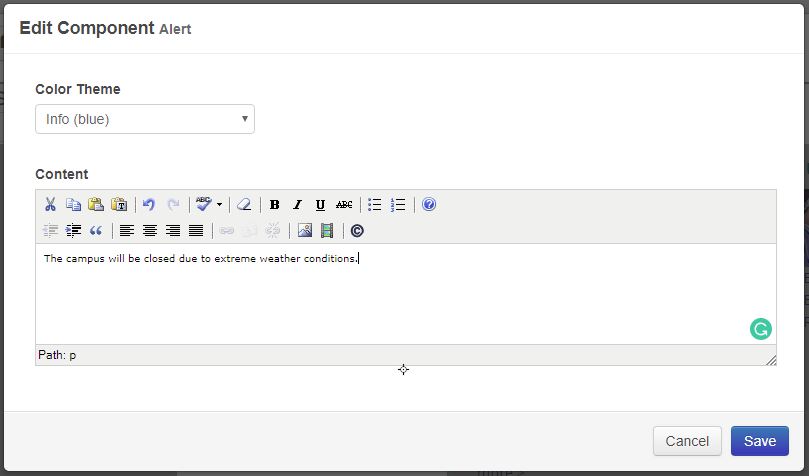
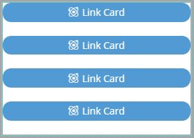
Component
To edit the component, click the edit icon (pencil) in Edit View and then edit the message in the corresponding modal:
OU Campus Edit View for Complex Components
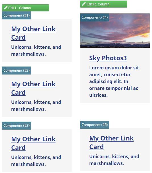
Things get a bit messier when you have a complex component. These include components that have logic modified using XSLT or those that have the WYSIWYG (What You See is What You Get) preview turned off.
WYSIWYG Preview: On
If you do have preview component turned on, be aware that users may be confused by the preview. There are options users may attempt to edit when in the Edit Region mode (instead of the Edit Component view)—such as editing the image source or formatting text from the WYSIWYG toolbar—which won't save when completed.
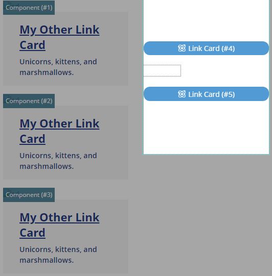
WYSIWYG Preview: Off
The alternative option (available in the Component's Source settings) is to turn off the WYSIWYG preview. It might be worth mentioning that if you have preview turned off, it may be difficult to figure out which component you intend to edit when you're using multiple similar components in the same Edit Region.
Example of Modified CSS to Append Component Count
One solution to identify each component is to modify the styles in your CSS to append a counter for each instance of a non-previewable component. (Note: this also relies on a class manually added to the component source called ou-component-counted)
Example of CSS modifying preview of component to include instance number
Example of CSS modifying edit view of component to include instance number
The CSS used for the above examples is shown below:
|
|
|
|
*Note: Using the backslash in ouc\:div prevents the CSS from treating the div as a pseudo element.
Linking Capabilities
One tool that is often useful for web editors is the Insert Link tool in OU Campus. It allows you to link to a page or anchor. However, snippets and components work quite differently. Components may be best for standalone environments; however, snippets may be preferable when users need to access features of the editable region–such as referencing link anchors, applying classes or inserting an additional snippet.
Snippets may be preferable when users need to access features of the editable region–such as referencing link anchors, applying classes or inserting an additional snippet.
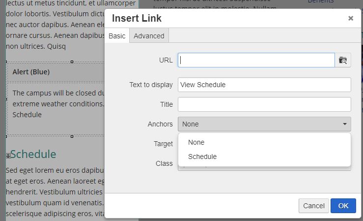
When editing a snippet, you’ll see options to add links and anchors that are available in the same Edit Region your snippet was placed in. In this example, #schedule is an available anchor in the Insert Link tool.
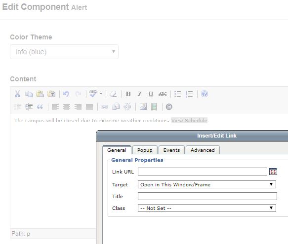
Components, on the other hand, are edited in a separate modal window. They do not have the option to link to anchors within the region it was placed. However, you can still use the less-powerful link options of the minimal WYSIWYG (similar to that found in the MultiEdit WYSIWYG regions.)
How does it show in source code?
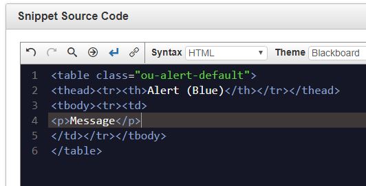
Snippet:
|
|
In this example, you could then do a search for "ou-alert-default" to find all PCF pages incorporating this specific type of snippet.
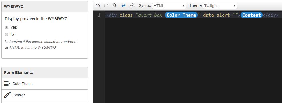
Component:
|
|
As you can see from the example above, there is some important information in these component calls:
|
|
Note: As of version 11.1, you can now Find/Replace content within a component instance on a page.
Previewing Content
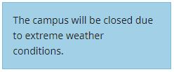
On saving, both components and snippets show identical to their published view (unless your snippet or component relies on server-side code to run.)
Snippets and Components show the same result in page preview:
Maintainability and Creating Changes
Both snippets (using table-transformations) and components can use XSLT to create different designs based on logic. Often, this will mean adding a new section or modifying selected features in XSLT as well as within the snippet or component itself. Now, what happens when you make these changes to related XSLT? Unlike pages using assets, pages using snippets and components will need to be manually republished for the XSLT-based changes to reflect on your website.
Snippet:
Component:
Further, OU Campus documentation shares the following:
“If an existing component is launched with changes that are significantly different from how it exists on pages (i.e., adding a new required element), then the extant instances of the component will not change until the next time someone edits the component content on a page. Then, the newest version will be used. For minor changes (such as changes in helper text), the components will be updated automatically on launch.”
Where can each be used?
Knowing the limitations of the functionalities is one aspect, but another important part of understanding if a component works for your situation is deciding where will it be used. Currently, assets and MultiEdit WYSIWYG regions do not include the option to insert a component.
| Region | Snippets | Components |
|---|---|---|
| Page Editable Region | yes | yes |
| MultiEdit WYSIWYG Region | yes | |
| Web Content Asset | yes |
Final Considerations
When creating a snippet or component for your next OU Campus feature, consider where your feature will be placed (editable region or asset) and how it will be used (will users need access to surrounding links and styles?) I hope this article helped showcase features and limitations of both uses. It is important to note that OmniUpdate strives to continually evolve the OU Campus CMS and features. Please reach out if you have any questions or suggestions related to my examples.
Updated October 23, 2020