Using Image Sets to Create Responsive Images in OU Campus
By Jeanine | 2020-08-26
Responsive images allow you to deliver an optimally sized image to each device—preventing unnecessarily large downloads and potentially speeding up your webpage. In this article, discover how responsive images work and how they can leverage Image Size Sets and snippets in OU Campus.
It’s no secret: these past years have seen ever-increasing sizes of images to feature on your school’s homepage. Though some designs are now implementing smaller images (and thankfully taking a step back from large carousels), these pages can still pack a punch to your visitors’ bandwidth. With over 30% of users likely visiting from mobile devices, it would be ideal that a 480px-wide mobile device only downloads a 480px-wide image instead of the 1200px-wide image that is typically designed for a desktop monitor.
How responsive images work
Let’s take a look at page speed for a site loading a large hero image.
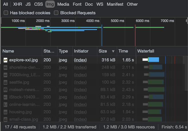
With a regular image tag, visitors will need to download the largest image regardless of which device they’re using. (Check image download speeds on your site by using Chrome’s Inspect Element > Network tab filtered by Img.) Large hero images are typically 300kb-1mb!
Instead, if provided a
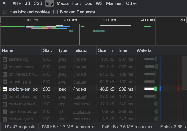
Delivering the optimized image can shave off seconds on page load time. Considering that “forty percent of web users abandon a website if it takes more than three seconds to load,” the time saved could also potentially increase conversions and lower bounce rates!
Testing responsive images for your next project
Now you know why they’re great; next, let’s go through how they are set up!
First, let’s look at the typical HTML for a <picture> element:
|
|
The fallback: <img>
In the above example, only one of the four images will load—depending on the screen size of the user’s device. It’s important to note that the <img> element is still present (last) in the list of images. Since this example is designed to be mobile-first, the <img> will be shown on mobile devices. It also supports older browsers, including Internet Explorer 11, that don’t support the <picture> element. (Yes, it might be a bit blurry, but IE users aren’t looking for optimal experiences, are they?)
Another important reason for including the <img> tag is that it can convey the alt tag description as well as the width and height of the image. Image widths and heights might seem arbitrary, but they’re becoming quite important again as we try to address issues of cumulative layout shift (CLS). The unexpected jumpiness of loading elements on your page may contribute to overall CLS. By ensuring your image has its height and width set, the browser has an idea of how much layout space to reserve for each image. This reserved space helps prevent delayed movement of content or unintended clicks.
Choosing alternative sizes
Though the <img> loads for the smallest device, as device screens get larger, the
For your project, first, determine the optimal sizes for your responsive <picture> tag. I would recommend using an image placeholder API that shows image dimensions to better understand when each image is loaded.
In the example above, click the zoom factor (1x, 0.5x, and 0.25x) to simulate different devices. Test out your code by resizing your browser window.
How to create responsive <picture> elements in OU Campus
With the recent addition of Image Size Sets within OU Campus, the ability to create a group of dynamically sized images is easier than ever!
- Review and set up image set sizes in OU Campus using consistent extension naming (referencing the example below.)
- Set up a directory to use your Image Set in access settings, and upload and publish the images in this new directory. (Publishing prior to editing a pcf ensure images are available.)
- Update XSL in snippets.xsl and functions.xsl.
- Implement the Build Picture snippet in and Editable Region.
- Confirm the media queries work for your images by resizing your browser window.
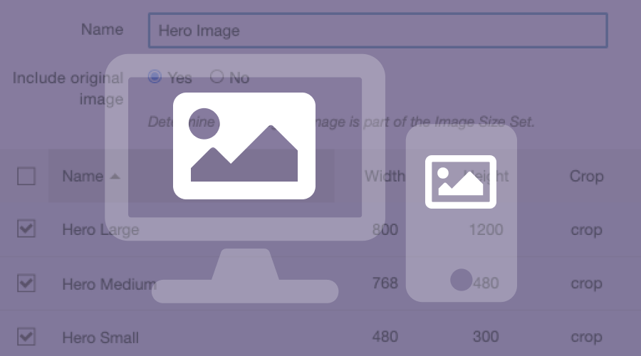
Image size setup
This example uses the following image size set with “crop” setting (note: you can use different resolutions):
| Size | Suffix | Width | Height |
|---|---|---|---|
| Small | -sm |
480 | 300 |
| Medium | -md |
768 | 480 |
| Large | -lg |
800 | 1200 |
| XL | -xl |
1200 | 1200 |
Snippet usage
Insert an image into the snippet using the -sm version of a set of images:
|
|
Using the code provided this example, the picture is set up using Bootstrap’s viewports (992px, 768px, 480px) and outputs the following HTML:
|
|
Interested in using image sets to create responsive images using the <picture> tag in your OU Campus site? View my complete code for setting up responsive images in OU Campus! If you’re not a web developer, contact me for assistance with implementing snippets or other OU Campus updates.