Adding Bar Graphs using Highcharts in OU Campus
By Jeanine | 2018-09-02
If you find yourself often updating handfuls of bar chart images, look into this solution to save you time and to help deliver your information more semantically. Using the Highcharts JS library, OU Campus users can now easily modify the bar chart data as needed.
In this example, the HTML table is transformed using the Highcharts library—it is free for non-profits, so go grab a Highcharts Non-commercial license.
On your page, include the Highcharts library file as well as your customized JS—specific to this type of bar graph setup. In your file at /_resources/ou/editor/wysiwyg.css or similar, add the following CSS to show the table in edit mode only:
|
|
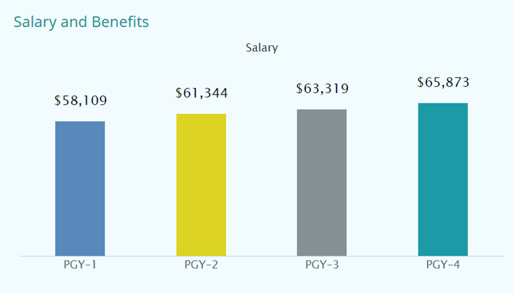
Here’s an example of how the Highcharts table looks using page edit view within OU Campus:
| Level | Salary |
|---|---|
| PGY—1 | 58109 |
| PGY—2 | 61344 |
| PGY—3 | 63319 |
| PGY—4 | 65873 |
A working sample of Highcharts using an HTML table and JS:
See the Pen Bar Graph by Jeanine (@virtual) on CodePen.
View a live version I implemented on Morehouse School of Medicine’s GME Salary webpage.
Additional customization notes:
- I had to use an en dash (—) in the label with the numbers, otherwise Highcharts transformed this data into a date label
- With the non-commercial license, you can remove the Highcharts logo by setting
credits: { false } - For a variable number of columns, add an array of colors in the JavaScript file; it will loop through the colors as needed
Not quite sure how to implement this vertical bar graph on your own site? Contact me to learn more.