Explore Montana State University
By Jeanine | 2016-04-27
Creating a lead generation page for your university or institution? Here are a few thoughts after implementing the “Explore” page for Montana State University.
In 2015, I had the pleasure of implementing a university lead generation form designed by Graphic Designer Ron Lambert and the Montana State University marketing team!
Overall this design was challenging due to a few of our special page requirements:
Keep the users on the lead page
In order to get the contact information we hoped for, we had to include enough content to remain informative without linking to other pages.
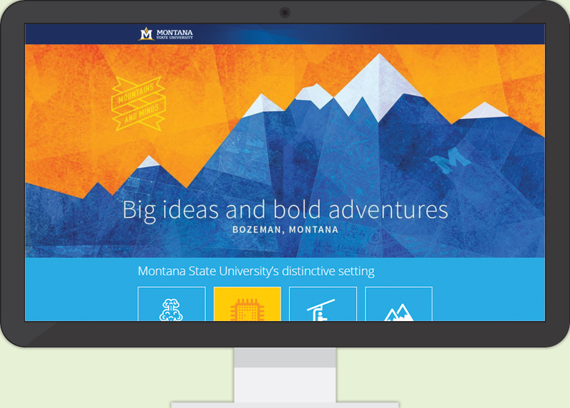
The clever flip over and hover tiles showed additional information without crowding the space. In addition, we chose images that conveyed messages without any text. For example, the section explaining MSU’s majors is interesting, but we didn’t need a paragraph on our beautiful surroundings—that photo speaks for itself!
Use OmniUpdate Content Management System to house our custom page
In implementing this design, we needed to change pieces of the theme for this page only, but we didn’t want to modify the CMS’s XSL templates. Some of our solutions included the following:
- Disable the heading link for the site logo using JavaScript.
- Remove the bulk of heading and footer elements using a custom stylesheet.
- Create assets for each SVG icon—this worked remarkably well for keeping the SVG code inline once published but keeping the page tidy when editing!
Maintain minimal page load time even with a lot of media
Due to the parallax design and large banner, all images and files had to be compressed to keep load times down. Also, we worked to implement SVG icons instead of PNGs or GIFs. The SVGs also made the page more fun to “play” with—the colors could easily change using simple CSS!
Though this was a time-consuming creation, our page analytics showed that it barely made any return on the effort put into it. Given more time on it, I would make the following recommendations:
- Add Twitter card metadata so the page looked beautiful when shared.
- Change the text on the form button to make the offer more enticing. HubSpot’s article about lead generation forms points out that the submit button may be the “final opportunity to convince your visitors that they should fill out those last few fields.”
- Make the benefit more clear to the user—explain what the Explorer’s Guide contains or why it will be exciting to receive.